Data Interpretation has become an essential tool in today’s world. Everything you use from social media applications like, Instagram, Facebook, to startup ventures make use of this tool. They sort, structure, and draw conclusions from the user-generated data and turn it into revenue in the process. It is no wonder that top business schools like IIM’s, SPJIMR, IMT’s test students’ data interpretation abilities in their entrance exams. Data Interpretation questions appear in the DILR (Data Interpretation and Logical Reasoning) Section of the test. Most questions ask to interpret a Pie Chart in the CAT exam.
Introduction:
A pie chart is a circular representation of data. This data in the pie chart is divided into segments. These segments denote a single category in the given data. The arc length of each segment (along with its central angle and area) determine the quantity it represents. Pie charts either use percentages or angles to measure and compare the relative quantity of each category.
Example:
It is evident from the given pie chart here how much the data consists of each category, i.e., Cats, Dogs, Birds, Mice respectively. Therefore, We can say that the category the data most comprises is Dogs from the pie chart, followed by Cats. Similarly, the category the data least comprises is Mice.
Although, this is quite simple when you need brief insights of the model, it is not as simple to accurately interpret the data. Most CAT questions are tougher than this but with the approach given below, it will become a piece of cake.
Pie Chart Approach for CAT:
1. In the Pie chart know that all the given categories or items equate to 360 degrees and the degrees of the angles, representing different categories, are calculated proportionately.
2. To make it easier, visualize that the entire diagram looks like a real pie. The pie’s components resemble slices cut from the pie.
3. Now, here is an example pie chart:
Visualize the components as the slices of a real pie.
4. A question will give you the measurement quantity of one of the categories. Use this measurement in relation to its respective category, to find how much 1% is in the measurement quantity.
Example:
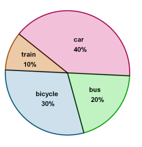
i) Let’s assume from the above pie chart that there are 40,000 total buses for road transportation.
ii) So, 40,000 buses constitutes 20% of the buses.
iii) Then, how many buses constitute 1%? In order to find this, use this formula: (x%/100) × Quantifiable measurement given with respect to category. Therefore it will be (20/100) × 40000.
iv) After solving the formula above, we know that 1% constitutes 8000 buses (or other vehicles for other categories).
5. Consequently, how much 1% constitutes will help you find out the quantifiable measurements of other categories if asked.
6. When you are asked the percentage of the total quantifiable measurements from either one category or another, then combine the percentages of the two categories asked.
Example:
Options:
(a) 15%
(b) 20%
(c) 30%
(d) 12%
Correct option: (c) 30%
Reason: This concept is clear in sets. There is no intersecting category for Train or bus. So, We combine the independents sets of Train and Bus and get the resultant answer.
7. You will be asked the ratio of two categories in relation to each other. To solve the question, take the percentages given and reduce them to its lowest form.
If you have any difficulty understanding ratios, refer to Ratio and Proportion.
Example:
What is the approximate ratio of train to car?
Options:
(a) 1:1
(b) 2:1
(c) 3:2
(d) 1:4
Correct option: (d) 1:4
Example Question:
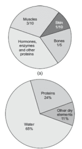
1. How much of the human body is neither made of bones nor skin?
(a) 40%
(b) 50%
(c) 60%
(d) 70%
Correct Option: (d) 70%
Reason: It is given ‘neither bones nor skin’. So, after combining the fractions and turning them into percentages, we get 30%. Consequently, We subtract the 30% from the 100%. As a result, we get 70%.
2. What is the ratio of the distribution of proteins in the muscles to that of the distribution of proteins in the bones?
(a) 2:1
(b) 2:3
(c) 3:2
(d) Cannot be determined
Correct option: (d) cannot be determined
Reason: The question doesn’t give this data.
3. What percentage of proteins of the human body is equivalent to the weight of its skin?
(a) 41.66%
(b) 43.33%
(c) 44.44%
(d) Cannot be determined
Correct Option: (a) 41.66%
Reason: The assumed percentage is X.
X = (24%)/[(1/10)×100)]
X = 10/24
X= 0.4166