Bar Graphs are an integral part of the DILR (Data Interpretation and Logical Reasoning) Section of the CAT Exam. The main reason for this is their flexibility and versatility in presenting data. That’s the reason they are used extensively due to the beginning of times, due to their visual impact.
Here are some points to keep in mind when you work with bar graphs and bar charts:
1. Bar diagrams are visual aids for presenting statistical data. We use bar charts, different colours, shades, dots, dashes, etc. to distinguish between continuous variables. There will always be explanatory index indicating the meanings of the different colours, shades, and markings.
2. Each bar diagram has a title (which is either at the top or at the bottom of the diagram) indicating the subject in the diagram. Besides, sometimes, there may be footnotes at the bottom of the diagram to explain facts that are not clarified in the title. The student must be very careful about reading these footnotes and not to overlook these facts while interpreting bar charts.
3. One axis (normally the x-axis) of every bar diagram will represent a discrete variable, while the other axis represents the scale for one or more continuous variables.
Types of Bar Graphs
1. Simple Bar Graph
True to its name, Simple Bar Chart is the “simplest” form of data representation in bar graphs. It has one continuous variable charted along with one discrete variable.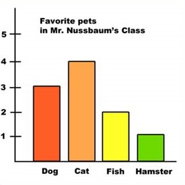
You can represent the following types of data on a simple bar chart:
| Discrete Variable | Continuous Variable |
| Years | Sales trend of a company |
| Years | Sales (in units) trend of a single company |
| Years | Profit trend of a single company |
| Years | Profit per unit trend of a single company |
| Years | Number of employees trend of a single company |
| Years | Population trend of a single country |
| Company names | Sales of each company for a particular year |
2. Stacked Bar Graph
Typically, the length of a bar, on a bar graph, represents the magnitude or measurement of a single continuous variable. However, in certain cases, it might be better to break up the measurement of the main continuous variables into its components. When it is broken up into components, then the data is represented in the form of a graph formed called a stacked bar chart. 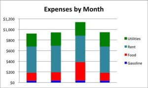
We use different shades or colours to distinguish the various parts or components. The index is present along the graph or chart to explain these differences.
Note: Sometimes, we also use stacked bars to represent percentages. This kind of graphs are convenient for comparing different data sets.
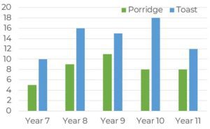
3. Composite Bar Graph
We cannot use Simple Bar Graphs to represent two or more sets of continuous variables. For this purpose, we use Composite Bar Graphs.
A Composite Bar Graph is used to describe data for different subgroups of the main group of data. A separate bar represents a specific subgroup. The bars have different shades of the same colour or different colours to set them apart from the rest.
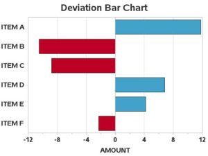
4. Deviation through Bar Graph
Deviation Graphs are helpful for the representation of continuous variables, which can have both positive and negative values. The positive values and negative values on this bar graph represent a surplus and a deficit, profit and loss, net of imports and exports etc. respectively.
Approach using an Example
Question
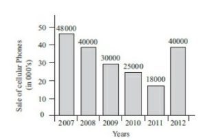
1. The percentage increase in sales from 2011 to 2012 was
Options:
(a) 115%
(b) 128%
(c) 122%
(d) 118%
2. The sum of sales of cellular phones in the years 2009 and 2011 is equal to that in
Options:
(a) 2007
(b) 2008
(c) 2010
(d) 2012
3. The two years between which the rate of change of cellular phones is minimum are
Options:
(a) 2007 and 2008
(b) 2009 and 2010
(c) Both (a) and (b)
(d) 2011 and 2012
4. The difference in all the sales of cellular phones for the years 2007 and 2009 is
Options:
(a) 500 units
(b) 1,000 units
(c) 5,000 units
(d) 18,000 units
Solutions with explanations
1.) Given in the graph:
Sales in 2011 = 18,000
Sales in 2012 = 40,000
Increase in sales between 2011 and 2012 = 40,000 − 18,000 = 22,000
Percentage increase in sales between 2011 and 2012 = [(22,000)/(18,000)] × 100 = 122%
The correct answer is (c)
2.) Given information in the Bar Graph:
Sales of phones in 2009 = 30,000
Sales of phones in 2011 = 18,000
Sum of Sales of phones in 2009 and 2011 = 30,000 + 18,000 = 48, 000
In the bar graph, 48,000 phones were sold in the year 2007.
So, the correct option is (a)
3.) Given information in the Bar Graph:
Sales of phones in 2007 = 48,000
Sales of phones in 2008 = 40,000
The rate of change in years 2007 and 2008 = (48,000)/(40,000) = (6/5)
Then,
Sales of phones in 2009 = 30,000
Sales of phones in 2010 = 25,000
The rate of change in years 2009 and 2010 = (30,000)/(25,000) = (6/5)
Both (a) and (b) have same rate of change.
Analysing option (d),
Sales of phones in 2011 = 18,000
Sales of phones in 2012 = 40,000
The rate of change in years 2011 and 2012 = (18,000)/(40,000) = 9/20
Therefore, the correct option is (c) after eliminating (d).
4. Given information in the Bar Graph:
Sales of phones in 2007 = 48,000
Sales of phones in 2009 = 30,000
Difference of net sales in 2007 and 2009 = 48,000 − 30,000 = 18,000
Thus, the correct answer is (d)
We hope you found this useful! Our CAT coaching Kolkata. knows it can be hard to grasp the concepts of bar graphs, and we are here to make it easier for you. Drop us a mail at if you have any doubts.
Happy preparation!